Use the paragraph text in the Heading block to add a bit more information and context about the page.
Note: You’ll see three sections in the page block editor – Top Components/Main Components and Bottom Components. Use Top components for your head and possible a Call to Action component if you’re using one. Putting components in the Top or Bottom positions means they go full page width, whereas the Main Component section is pre-set for
The rest of your content should go in the Main Component section. This is set to a pre-set content width.
The Content (WYSIWYG) block component is your main content block for text on the page. It stands for What You See Is What You Get because you can see how your text will format before publishing.
Some general pointers for adding content:
Id interdum velit laoreet id donec ultrices tincidunt arcu non. Eget gravida cum sociis natoque penatibus et magnis dis. Imperdiet sed euismod nisi porta lorem. Nulla facilisi nullam vehicula ipsum a. Sit amet purus gravida quis blandit turpis cursus in. In hac habitasse platea dictumst vestibulum rhoncus est pellentesque. Scelerisque eu ultrices vitae auctor eu augue ut lectus arcu. Lobortis elementum nibh tellus molestie nunc.
When you use Heading 2 with clear headings about each section, Google is able to better understand what the page is all about, and it is good for our Google rankings, meaning we’re more likely to appear on page one of search results. Using good keywords for headings is another way to improve our search engine optimisation. Speak to the comms team if you have any questions and we’ll help you make sure your page is laid out in a way that makes sense to Google.
Feugiat in fermentum posuere urna nec. Ipsum a arcu cursus vitae congue mauris. Blandit volutpat maecenas volutpat blandit aliquam etiam. Faucibus a pellentesque sit amet porttitor eget dolor. Hac habitasse platea dictumst vestibulum rhoncus est pellentesque elit ullamcorper. Proin fermentum leo vel orci.
Keep Heading 3 headers clear and relevant, but you don’t have to worry so much about keywords. H1 and H2 are your main tools for optimising the page for Google. That, and quality content on the page.
Sit amet purus gravida quis blandit turpis cursus in. In hac habitasse platea dictumst vestibulum rhoncus est pellentesque. Scelerisque eu ultrices vitae auctor eu augue ut lectus arcu. Lobortis elementum nibh tellus molestie nunc. Id interdum velit laoreet id donec ultrices tincidunt arcu non. Eget gravida cum sociis natoque penatibus et magnis dis. Imperdiet sed euismod nisi porta lorem. Quis blandit turpis cursus in hac habitasse platea dictumst quisque.
If you click the ‘Layout’ tab on a WYSIWYG content block, you can toggle on a box for content so it appears in this style. This is really handy if you’re wanting to pull focus on a piece of content.
Sit amet purus gravida quis blandit turpis cursus in. In hac habitasse platea dictumst vestibulum rhoncus est pellentesque. Scelerisque eu ultrices vitae auctor eu augue ut lectus arcu. Lobortis elementum nibh tellus molestie nunc. Id interdum velit laoreet id donec ultrices tincidunt arcu non. Eget gravida cum sociis natoque penatibus et magnis dis. Imperdiet sed euismod nisi porta lorem. Quis blandit turpis cursus in hac habitasse platea dictumst quisque.
You’ll notice a navigation bar on the left-hand side of the page. This is called ‘Anchor Navigation’, where you can quickly skip to the section of the page using an internal hyperlink.
Use this if you’re laying out some long-form content that has a number of sections to help people find the content they’re looking for easily.
To set this up you need to do a couple of things:

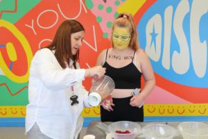
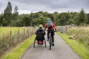
The above image is a standard image using the Media component. When you add images using this component, it will automatically size them to the width of the text on the page, so try to use landscape images where possible to avoid images looking a bit weird and taking up too much space on the page.
You can also add videos using the Media component, see below. You have the option to upload a video direct via the media library, or to use an embededd video. This just means the video is pulled through from YouTube or Vimeo using a url. We strongly advise using an embedded video as this is better for page loading times. If you need support having video content uploaded to YouTube or Vimeo, please speak to the comms team.
"Block Quote component is great for pulling focus to a specific quote on a page. Great for major news articles, blogs, and also if you want to include and highlight a quote from a young person, e.g. Universal Youth Work Outcomes research page."
Person cited here
The Letterbox Image content block differs from a standard Media content block in that the image stretches across the full width of the page. For this reason, landscape images are especially recommended. Square or portrait orientation photos are likely to look odd using Letterbox component.
The Content with Media block is a great way to highlight key content for your page. This could be a publication, a resource, or a specific page you want to drive people to. To use the Content with Media block:
Write up 2-3 sentences showcasing your content. Give people a reason to click through using strong messaging etc. Eget gravida cum sociis natoque penatibus et magnis dis. Imperdiet sed euismod nisi porta lorem. Quis blandit turpis cursus in hac habitasse platea dictumst quisque.

Write up 2-3 sentences showcasing your content. Give people a reason to click through using strong messaging etc. Eget gravida cum sociis natoque penatibus et magnis dis. Imperdiet sed euismod nisi porta lorem. Quis blandit turpis cursus in hac habitasse platea dictumst quisque.

Accordions are a great component for embedding content within clear headings. They use a dropdown function so that content is hidden until you click to expand it. Use cases could include FAQs for delivery of youth work or specific funds; individual outcomes or indicators for the Youth Work & Skills Framework; adding in explainers to longer-form content. Very useful and flexible though.
To use them, add the component into your stack and add a row for each dropdown you want included. Enter the text you want to appear as a header into the title field, and use the rich text editor in the Description field to enter all the content you want to appear in the dropdown. You can even add images to an accordion, but I would recommend against this as it looks untidy.
Add a link in the right-hand column to add a button.
Sit amet purus gravida quis blandit turpis cursus in. In hac habitasse platea dictumst vestibulum rhoncus est pellentesque. Scelerisque eu ultrices vitae auctor eu augue ut lectus arcu. Lobortis elementum nibh tellus molestie nunc. Id interdum velit laoreet id donec ultrices tincidunt arcu non. Eget gravida cum sociis natoque penatibus et magnis dis. Imperdiet sed euismod nisi porta lorem. Quis blandit turpis cursus in hac habitasse platea dictumst quisque.
The Stats content block is a lift from the Impact Hub page. Brilliant tool for breaking up content, brightening up the page and pulling focus on the impact of youth work.
You could use these on project pages like #IWill, #YouthVIP, Digital Youth Work etc to demonstrate impact, or also good for writing content about the impact of a fund. We’ve also got the option to build specific impact hub pages for each thematic area of youth work eg youthlink.scot/impact/youth-work-and-schools etc.
To use the Stat content block:
Note: When adding links to resources using the Stat content block, make sure you check the ‘Open in new tab’ box to stop people navigating away from the primary content page.
The Download content block is great if you’ve got a bunch of files you need to quickly and clearly lay out on the page. Think National Grants programmes laying out a bunch of application forms, guidance, list of recipients etc, or for Job Description/Person Description etc on job listings.
Documents are neatly styled depending on which type of file you select from the media library.
Supported formats:
Note: This component is specifically for documents, so you’re not able to include media files such as images, video etc in the list.
Use the Call to Action component to really bring an important piece of content to a user’s attention. They’re particularly effective right underneath the header or at the bottom of your page.
Leave the Super Title field blank. Still thinking about the use case of this, it might be that we use it for highlighting certain content belongs to a specific campaign or thematic area. TBC.
Suggested use cases for Call to Action component:
The trick is to give people a really good reason to click on either of the call to action buttons below. Feugiat in fermentum posuere urna nec. Ipsum a arcu cursus vitae congue mauris.
The Large Call to Action component can be used when you’re wanting to include some images to a call to action. Either add a similar image and it’ll be formatted to round the corners in keeping with the rest of the website’s image style.
If you want an image grid (see below) then simply add six images using the Image Grid tab in the component, rather than using the Media tab.
You can also select from our full colour palette to brighten up the page.


The Call to Action Split component is another great tool for breaking up content or text on the page with some engaging media. Similar to Large Call to Action but just styled differently. Again, the alignment of the component can be switched in the Layout tab so you can alternate on the page to create a nice effect on the page.

Use of the Smart Filter component is reserved to the communications team as it only really relates to our main landing pages which are based on filterable models (Funding/News & Events/Resources etc).
The Selected Listing component is handy for cherry-picking some related content you want for your audience. You can choose from news articles, blogs, events, funding opportunities and resources, giving you a great opportunity to quickly and easily showcase related content and materials.
If a selected item doesn’t have an associated image, it will simply appear as a styled card on a solid background.
Note: Although the component gives you the opportunity to add different categories of content – be aware that the styling for each card may differ from category to category, so try to avoid listings looking messy and uneven.
See latest news articles about this year's National Youth Work Awards:
The Custom Listing component is what you would use to lay out a grid of cards to direct website users to different pages or content. For example, this is what’s used on the main landing pages (Education & Skills, National Grants Programmes etc) to lay out all the available subpages.
A few things to note:
See various examples of cards laid out on the page, depending on how many rows have been selected and whether or not an image has been applied. You can see how this ends up in us having a wide range of options in terms of laying out content on the page, so we’ll need to make sure we stick to a consistent pattern for this going forward.


Styling the cards vertically creates almost a listing effect with the cards.
Use the Embed/Shortcode component if you need to paste an embed link into a block to generate content. For example, the contact form below (generated using the WP Forms plugin) is an embed code that I’ve copied from WP Forms and pasted into the Embed/Shortcode content block, which then recreates the following form on the page with appropriate styling.